User interface trends - Neumorphism [Part 1/2 - Backstory]
First of all let me point out I'm a developer dabbing my toes into professional design. From my first programs as a child I always cared about making them look good. As a teen I loved the Material Design hype train, but then starting collage design went on the back burner. Now I'm finishing my masters degree and I have decided to take my design skills up to my development skills.
Today we'll discuss a emerging trend, what are it's inspiration, problems and how to make it work as a trend, and on the next one we'll do a little tutorial and maybe some more.
Neumorphism
Neumorphism is a modern take of a style of designing known as Skeuomorphism. But what is Skeuomorphism you might ask ? Simply its a term used in graphical UI design to describe objects that mimic real-world counterparts. Remember those old Apple icons ? They were Skeuomorphism, and it helped their users as everything was represented as something from the real-world.
As time passed, Apple started to replace its design with a new, modern look. Cue Flat Design. By 2019 Flat Design peeked, the entire community shifted and designers made the switch. Before i get any further into this i have to point out : Neumorphism is NOT a replacement of Flat design trend. But it’s an addition in UI design.

A shadow lurking in the dark
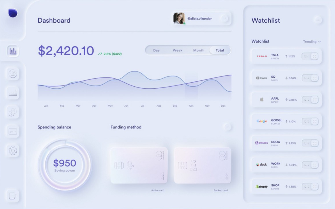
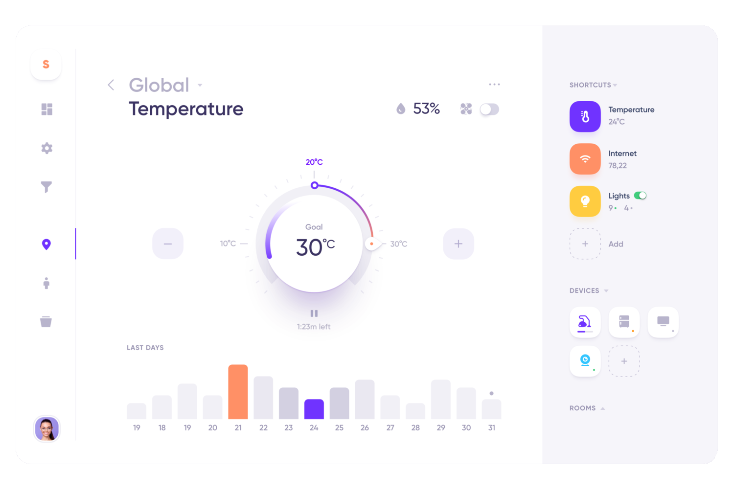
Today, on April 2020, taking a small scroll on Dribble or CodePen reveals there are new ideas and design being made by both talented design professionals and amateurs. Taking a closer look reveals they all look familiar, and contain the same keyword : "neumorphism". Go on, try searching for it. It will help you understand what really goes on in Neumorphism. But remember to return, I have much more to tell you.

So what is "Neo" about it ?
While the new style started widespread adoption in late 2019 there have always been personalized styles of it. While analyzing we can find it's inspired and continues to use old elements from its predecessor, but in a stripped down to the minimum way.
Shapes
Accessible, simple shapes are used whenever possible, and reused to create a overly repetitive interface. This is the single most distracting feature of Neumorphism, and a the reason it probably wont last that long unless used with Flat Design.
Palette
Usually pale colors are used. Colors close to white, beige and soft grays, mainly colors with low chroma. Gradients should only exist to drive interest to a specific region.
Representation
While Skeuomorphism tries hard to mimic the real world, neumorphism makes use of only very mild/subtle effects. It doesn't try to mimic nature but rather create a new form of analog elements from the old world.
Minimalism
Stepping away from realism to accessible effects for HTML and CSS like: double drop shadows, gradients, fill, stroke and inner shadows allows even average developers to achieve a desired look.